The Challenge
Designing a comprehensive "Experience Manual" for Bemoov, a tech company specializing in mobile payment solutions and digital services. The objective was to move beyond the traditional, dry "user manual" format and create a visually engaging guide that simplified complex technical onboarding for both consumers and business partners. The challenge involved translating intricate digital processes—such as multi-channel registration and QR code integration—into a clear, print-based educational tool that felt modern, accessible, and aligned with a forward-thinking tech brand.
Designing a comprehensive "Experience Manual" for Bemoov, a tech company specializing in mobile payment solutions and digital services. The objective was to move beyond the traditional, dry "user manual" format and create a visually engaging guide that simplified complex technical onboarding for both consumers and business partners. The challenge involved translating intricate digital processes—such as multi-channel registration and QR code integration—into a clear, print-based educational tool that felt modern, accessible, and aligned with a forward-thinking tech brand.
My Creative Process
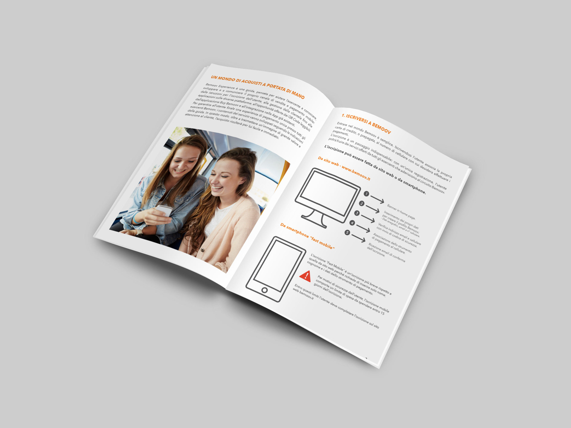
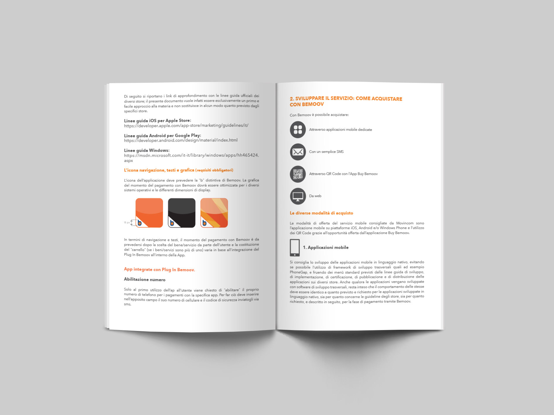
My approach centered on Information Design and a highly structured editorial layout. I prioritized a clean, minimalist aesthetic with a strong emphasis on white space to ensure the technical content remained digestible. I developed a custom set of infographics and flowcharts to visually map out the user journey across different platforms (Web, Smartphone, and App), reducing the reliance on dense blocks of text. By integrating lifestyle photography with a rigorous typographic hierarchy, I was able to "humanize" the technology, making the digital payment experience feel intuitive and everyday. I maintained strict brand consistency by utilizing the corporate orange as a functional accent color to highlight key actions and navigational cues.
My approach centered on Information Design and a highly structured editorial layout. I prioritized a clean, minimalist aesthetic with a strong emphasis on white space to ensure the technical content remained digestible. I developed a custom set of infographics and flowcharts to visually map out the user journey across different platforms (Web, Smartphone, and App), reducing the reliance on dense blocks of text. By integrating lifestyle photography with a rigorous typographic hierarchy, I was able to "humanize" the technology, making the digital payment experience feel intuitive and everyday. I maintained strict brand consistency by utilizing the corporate orange as a functional accent color to highlight key actions and navigational cues.
The Outcome
The resulting manual successfully bridged the gap between complex fintech architecture and user-friendly communication. It served as a vital touchpoint for the brand, streamlining the onboarding process and enhancing the overall perceived value of the service. The project demonstrates my ability to handle large amounts of technical data and transform it into a sophisticated editorial product. This work shows my passion for UX-driven print design and how to deliver professional, high-fidelity collateral for the fast-paced technology and digital services sector.
The resulting manual successfully bridged the gap between complex fintech architecture and user-friendly communication. It served as a vital touchpoint for the brand, streamlining the onboarding process and enhancing the overall perceived value of the service. The project demonstrates my ability to handle large amounts of technical data and transform it into a sophisticated editorial product. This work shows my passion for UX-driven print design and how to deliver professional, high-fidelity collateral for the fast-paced technology and digital services sector.
Technical Execution: Adobe Illustrator & Adobe InDesign.